Sargenti Architects is a dynamic architecture and design firm headquartered in Paramus, New Jersey, with additional offices in Los Angeles, Philadelphia, and London. Specializing in retail, restaurant, and corporate development, the firm offers comprehensive architectural and engineering services to clients worldwide. Their team of highly qualified designers, architects, and engineers is dedicated to creating iconic spaces and signature concepts that leave lasting impressions.
The Ask.
Sargenti sets the standard for architecture, engineering, and retail design that leaves a lasting impression through iconic spaces and signature concepts.
The Answer.
We planned, designed, and developed a dynamic new website to capture the essence of Sargenti’s brand.
The Goods.
- Website Planning
- Site Architecture
- Content Strategy
- Website Design
- Website Development
In the competitive landscape of architectural design, few firms stand out as prominently as Sargenti Architects. Renowned for their innovative solutions, meticulous attention to detail, and client-focused approach, Sargenti has established itself as a leader in the industry. This reputation is not just a product of their impressive portfolio but a testament to their unwavering commitment to excellence and forward-thinking design philosophy.

Driving Growth from Quality
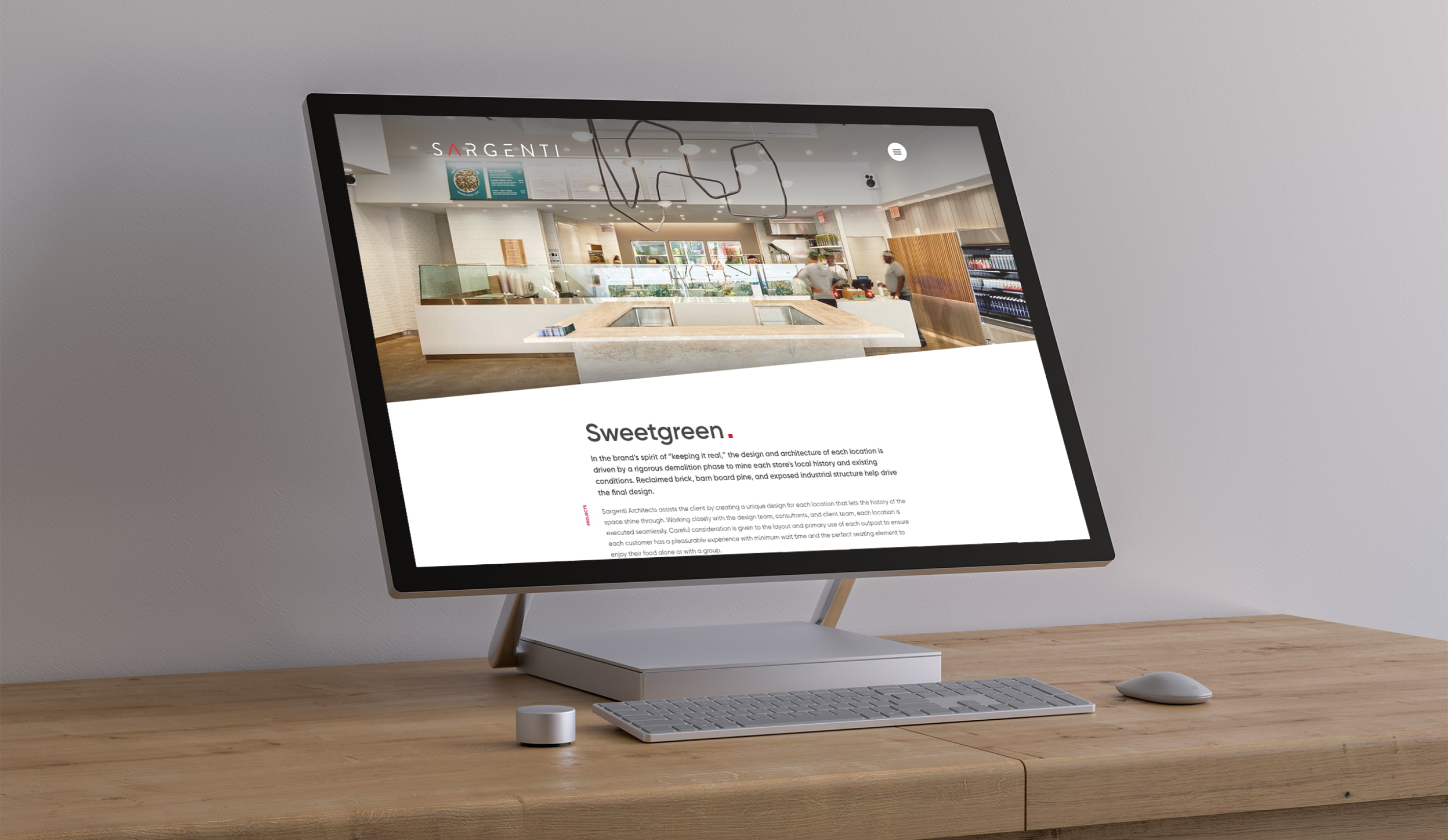
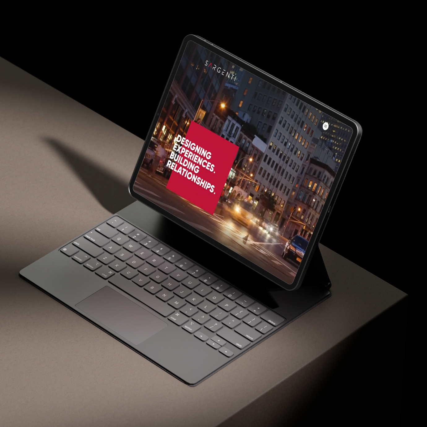
Featuring dramatic imagery, captivating video, and a bold color palette, we skillfully blended form and function to create a stunning user interface design. This design not only grabs attention but also effectively showcases Sargenti Architects' position as leaders in their competitive industry. The striking visuals and dynamic content work together to create an engaging and immersive experience for visitors, highlighting Sargenti’s innovative approach and high-quality work. Our design ensures that every element serves a purpose, providing a seamless and intuitive navigation that underscores Sargenti's expertise and reinforces their brand identity.

Retail Design Meets Digital Design
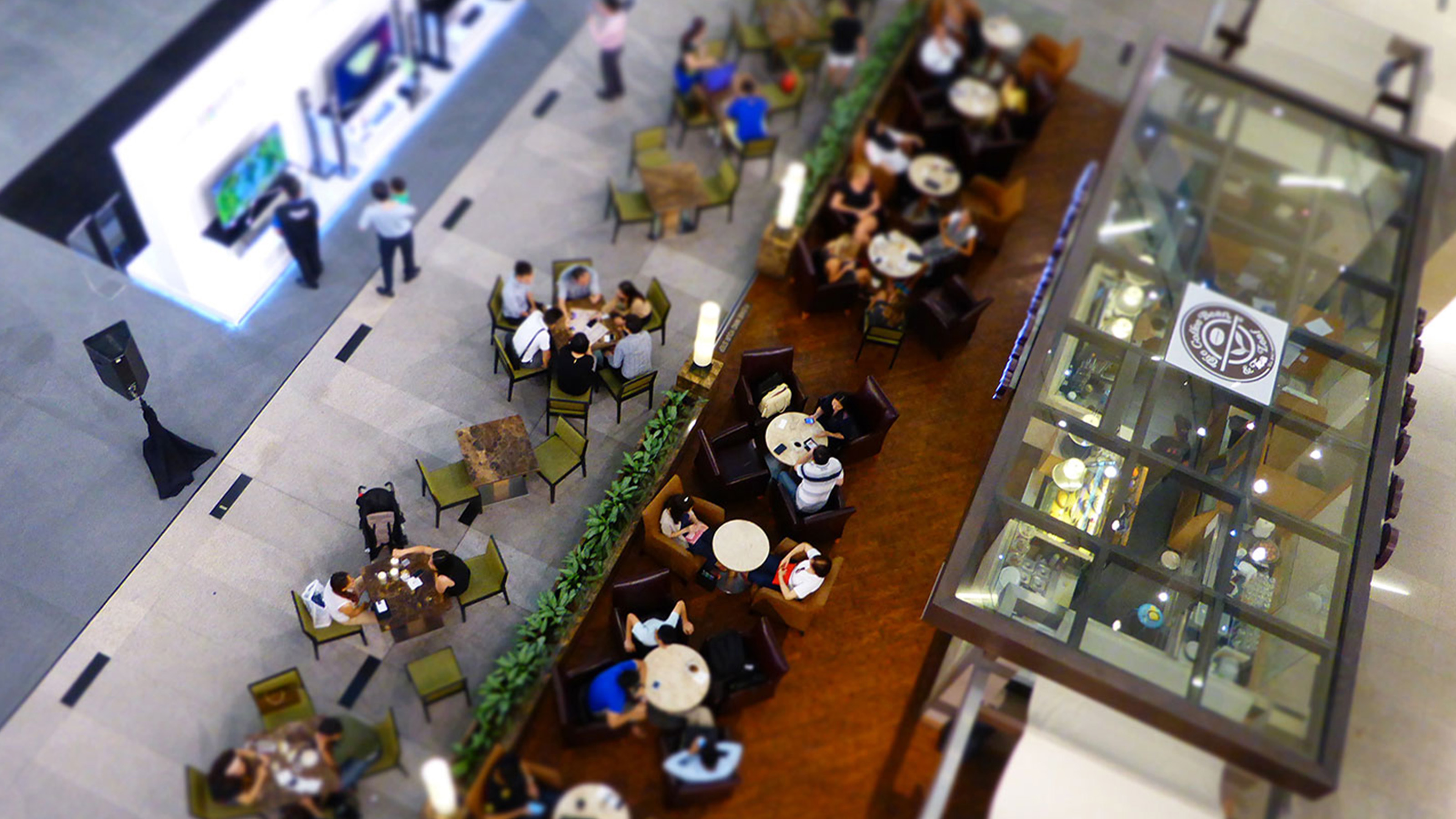
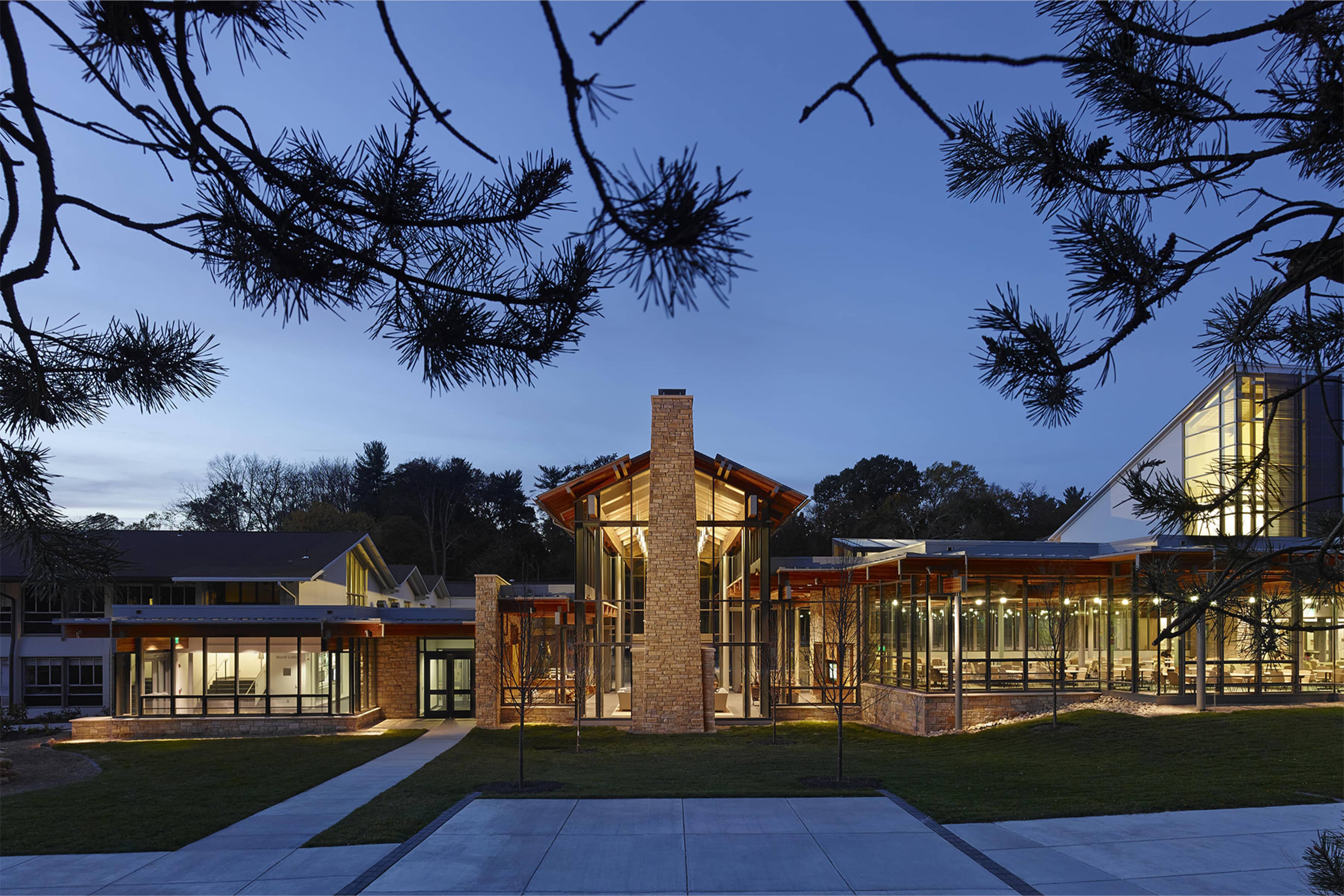
Sargenti is well known for their expertise and experience in retail space design. To communicate this, we designed a clean and user-friendly gallery of case studies, highlighting Sargenti’s most notable projects to date. The gallery features carefully selected images and concise project descriptions, offering a clear and straightforward presentation of their work. This approach allows visitors to easily appreciate the quality and scope of Sargenti’s projects without overwhelming them with too much information.
Testimonials that Speak
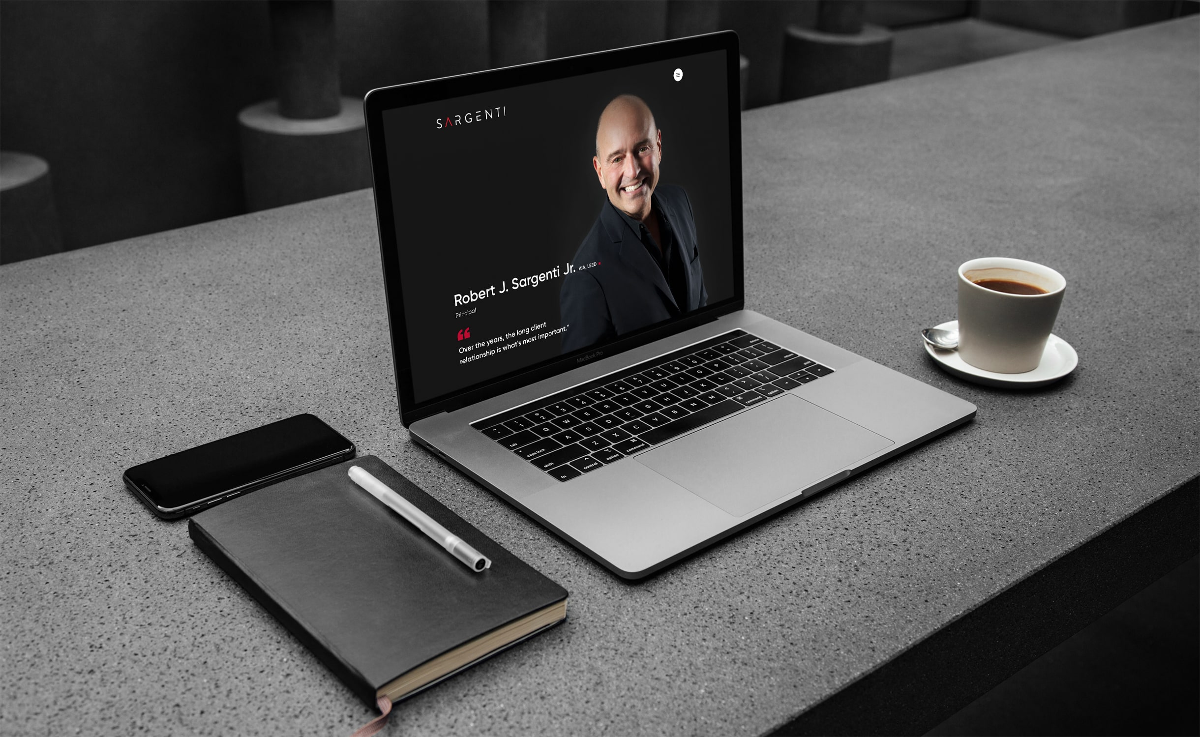
To highlight client satisfaction and reinforce Sargenti Architects' reputation, we designed simple yet effective testimonial blocks that fit seamlessly into the website. These blocks feature clean typography and a straightforward layout, keeping the focus on the clients' words. Subtle animations and consistent branding elements add a touch of visual interest without overwhelming the content. Each testimonial is thoughtfully placed to complement the surrounding information, providing genuine endorsements that enhance credibility and trust. This understated design approach quietly emphasizes positive client experiences and supports Sargenti’s standing in the architectural industry.
Mobile Responsiveness is a Non-negotiable
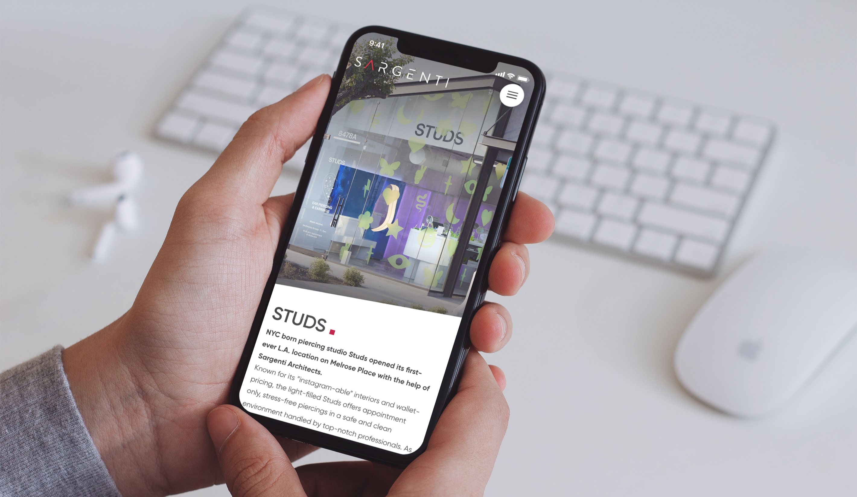
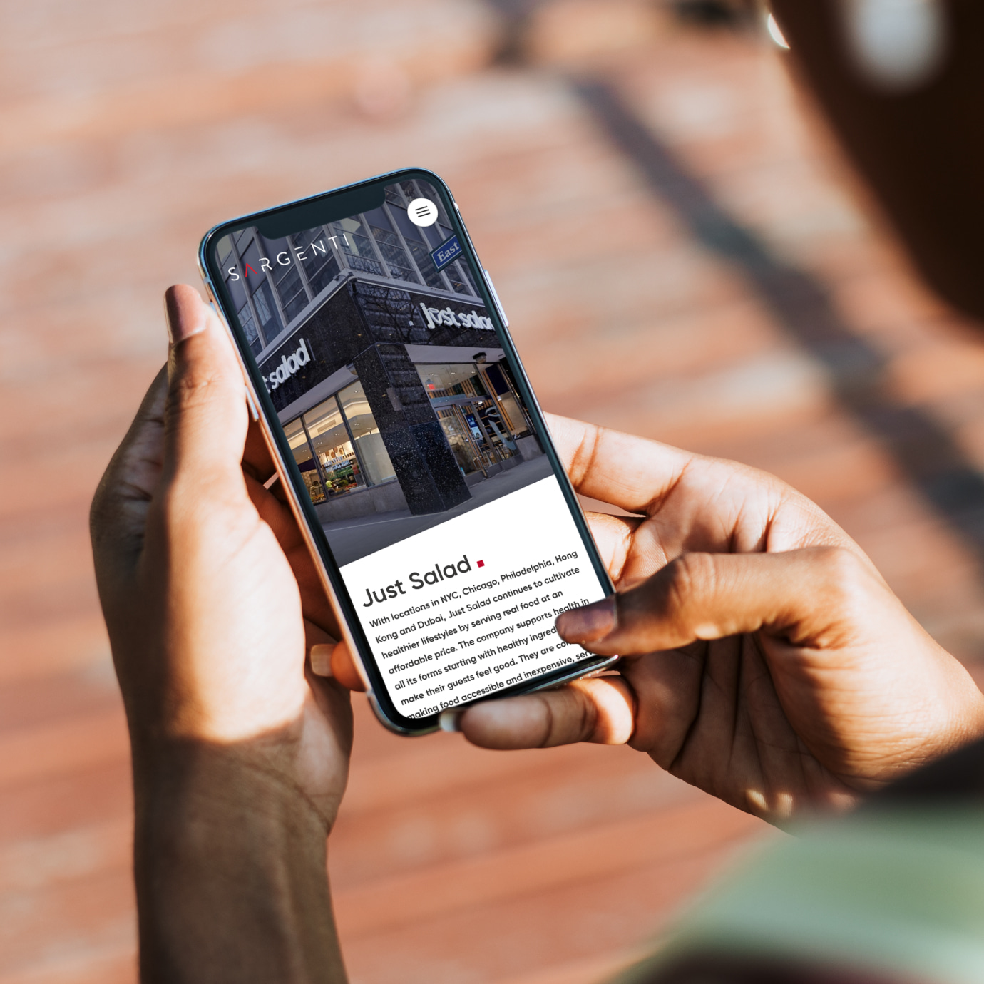
Making the site mobile-friendly was a key focus for us. We designed a responsive layout that adjusts smoothly to different screen sizes and devices. By optimizing features like the navigation menu and image galleries for touch interaction, we ensured a straightforward user experience. Prioritizing readability and ease of use, we made all content accessible on mobile devices. This approach is particularly important for architecture firms like Sargenti, as clients and stakeholders often need to view portfolios and project details on the go. Ensuring mobile accessibility helps maintain engagement and provides convenience without compromising on the site's quality or functionality.
A Timeless Portfolio
Our work on Sargenti Architects' website focused on showcasing their expertise and extensive portfolio through a clean, user-friendly design. By integrating visually appealing elements and ensuring mobile-friendly responsiveness, we created a platform that effectively communicates their strengths and achievements. The inclusion of client testimonials and case studies further reinforces their reputation in the architecture industry. Overall, the redesigned site provides a seamless user experience, reflecting Sargenti’s commitment to quality and innovation.
The Result.
