Daniel J. Keating Company is a distinguished general contractor and construction management firm based in Philadelphia. Established in 1911, the company has played a pivotal role in shaping the city's architectural landscape, delivering high-quality construction, renovation, and historic preservation services across sectors such as education, public service, and commercial development.
The Ask.
In the world of construction, Keating is renowned for delivering the finest quality work with an effective approach that aims to exceed, not simply satisfy.
The Answer.
Sharing these same core values, we planned, designed, and developed a dynamic new brand and website to communicate Keating’s commitment to excellence.
The Goods.
- Website Planning
- Site Architecture
- Website Design
- Website Development
- Print Design
- Iconography


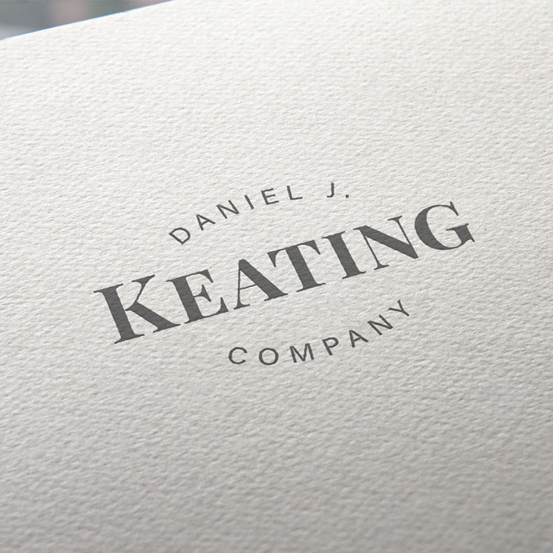
From The Ground Up
Third & Arch designed a new, typography-based logo and visual identity system based on a sophisticated wordmark. In addition, we developed a comprehensive brand style guide to ensure consistent branding across a full suite of marketing tactics.
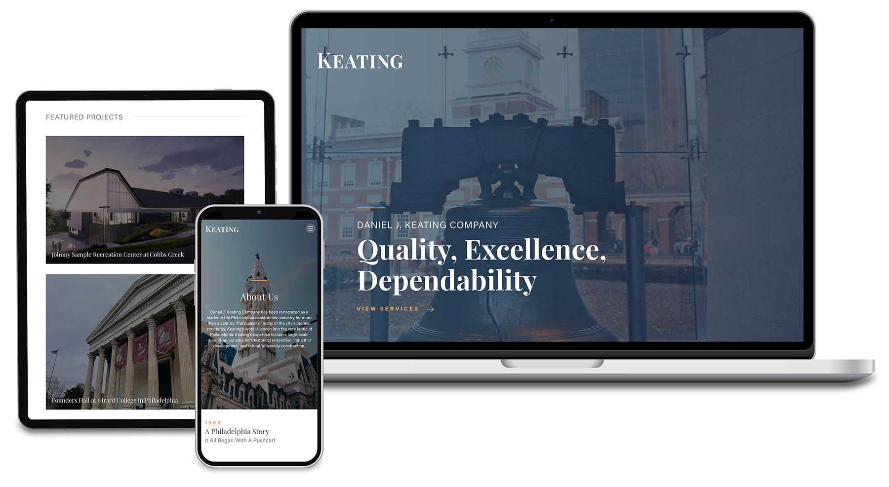
A Truly Flexible Web Design System
The new Daniel J. Keating website features a responsive user interface design, providing an ideal user experience across a wide range of devices. In addition, modern responsive design techniques offer better SEO performance, higher conversion rates, future-proofing, faster page load times, and enhanced brand perception.
Custom Iconography
To add visual flair and improve the usability of Keating’s new web design, we created custom illustrations of buildings that celebrate Philadelphia – the city we call home. These new icons combine the bold new color palette with the historical aesthetic of the storied construction company.
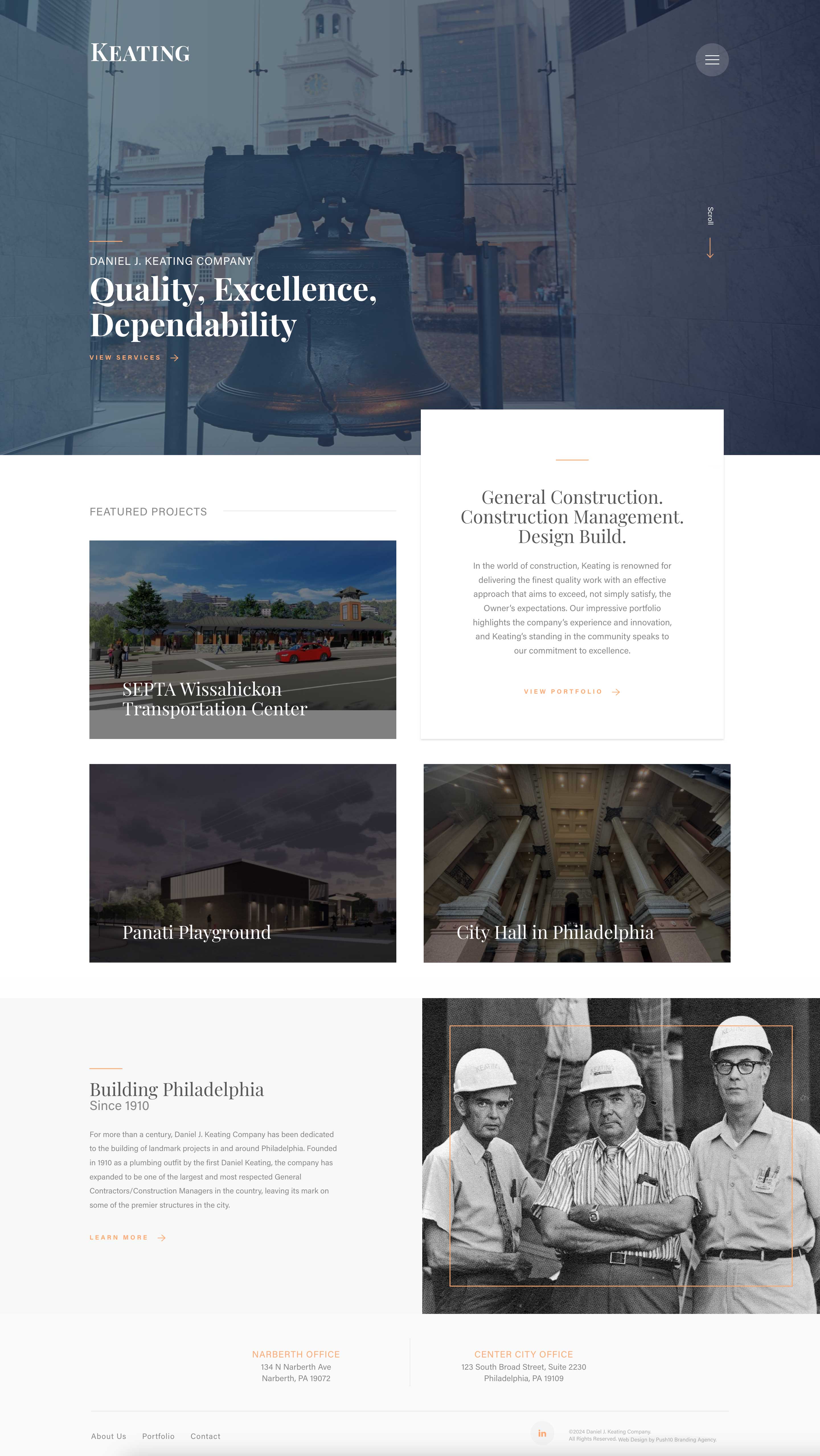
Long Scroll Page Layouts
The new site features long-scroll pages, offering a seamless and engaging user experience by allowing visitors to access large amounts of information without constantly clicking or navigating between pages. This modern web design technique is particularly effective in storytelling, where content can flow naturally, making it easier to guide users through a narrative or showcase a portfolio, as is often needed in AEC firms.
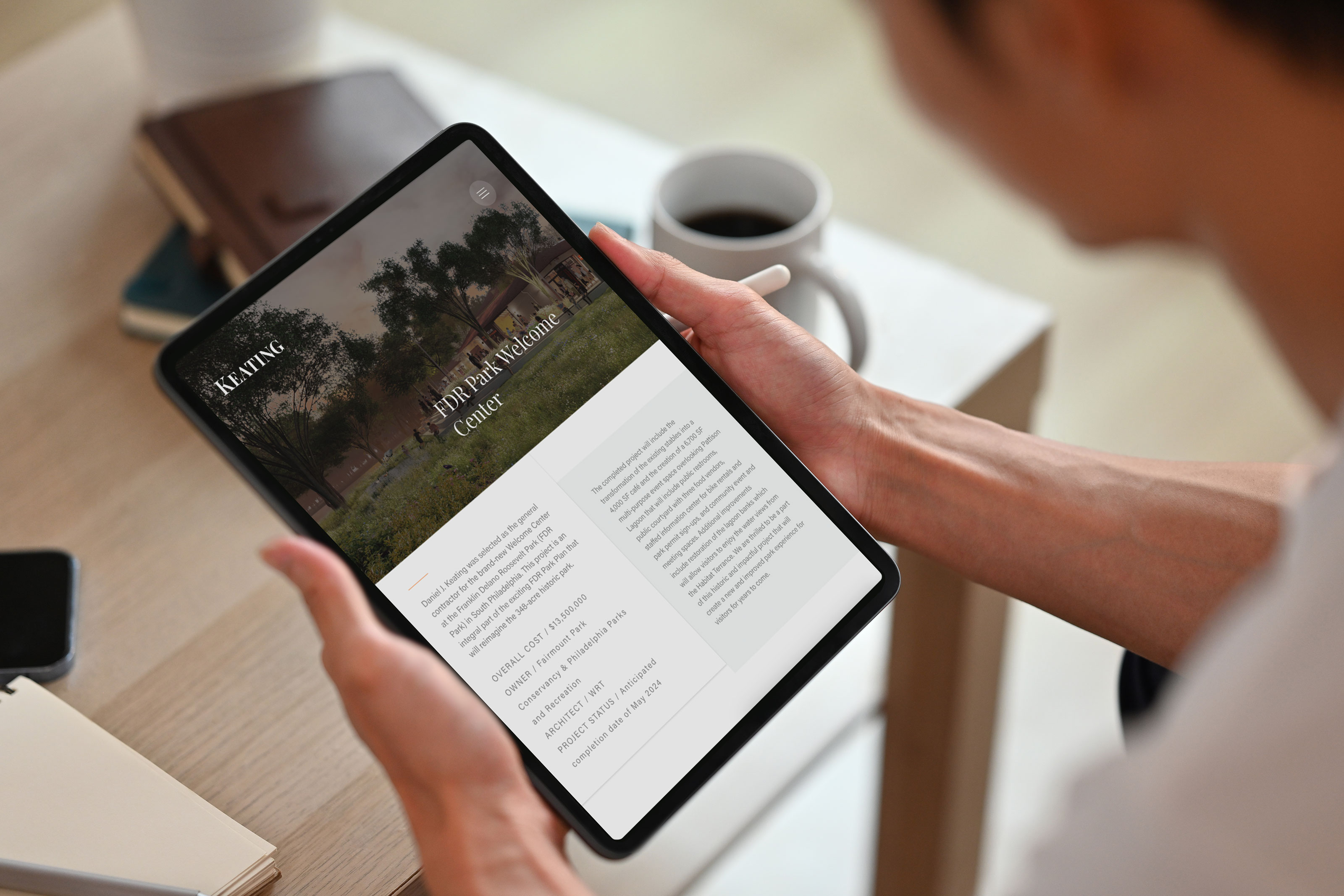
Dynamic Case Studies
Impactful project case studies are critical for construction firms because they demonstrate real-world expertise, highlight successful outcomes, and build trust with potential clients. We created visually-rich case studies, allowing Keating to showcase their technical capabilities, problem-solving skills, and experience managing complex projects.
The Result.
