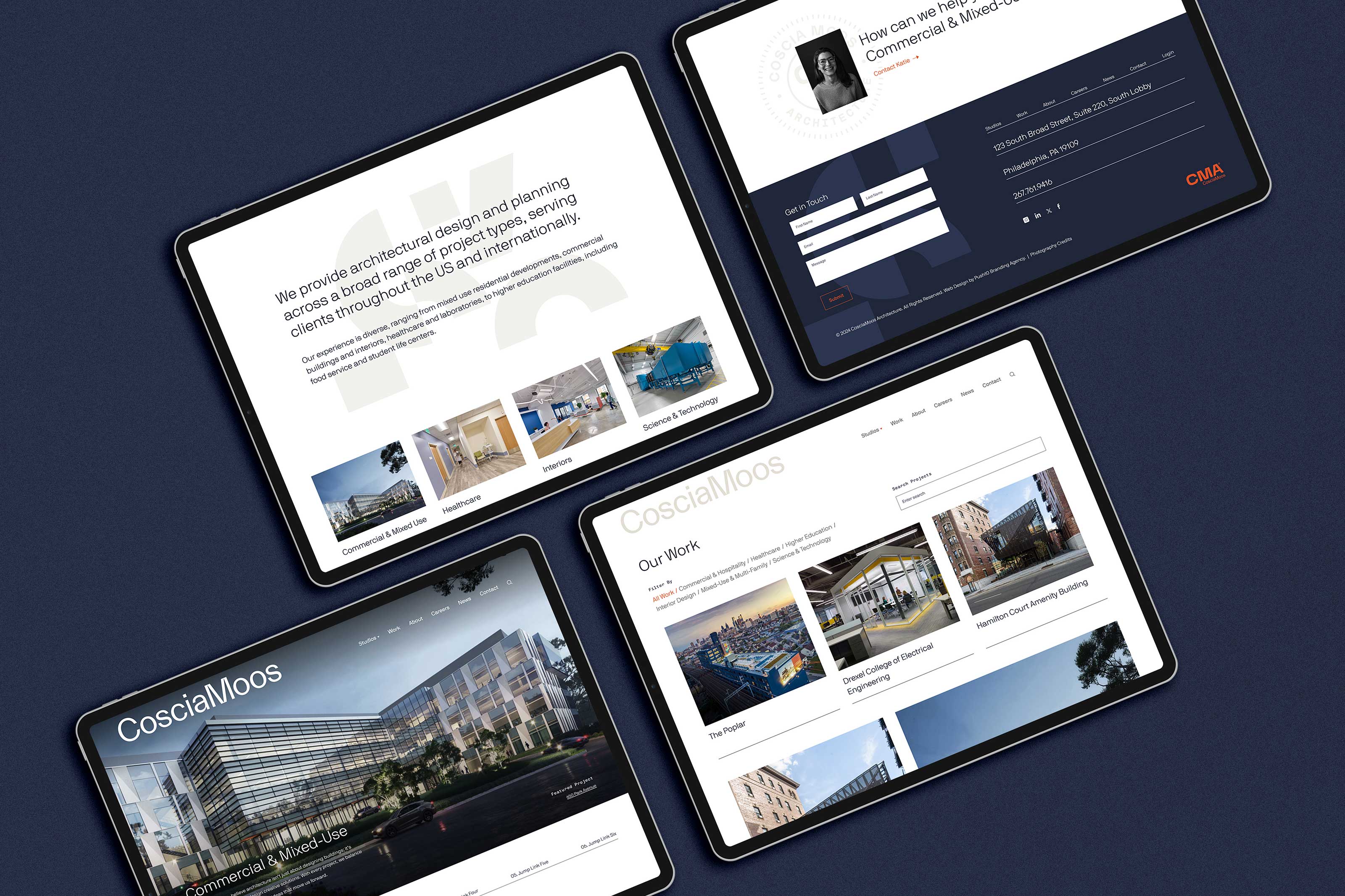
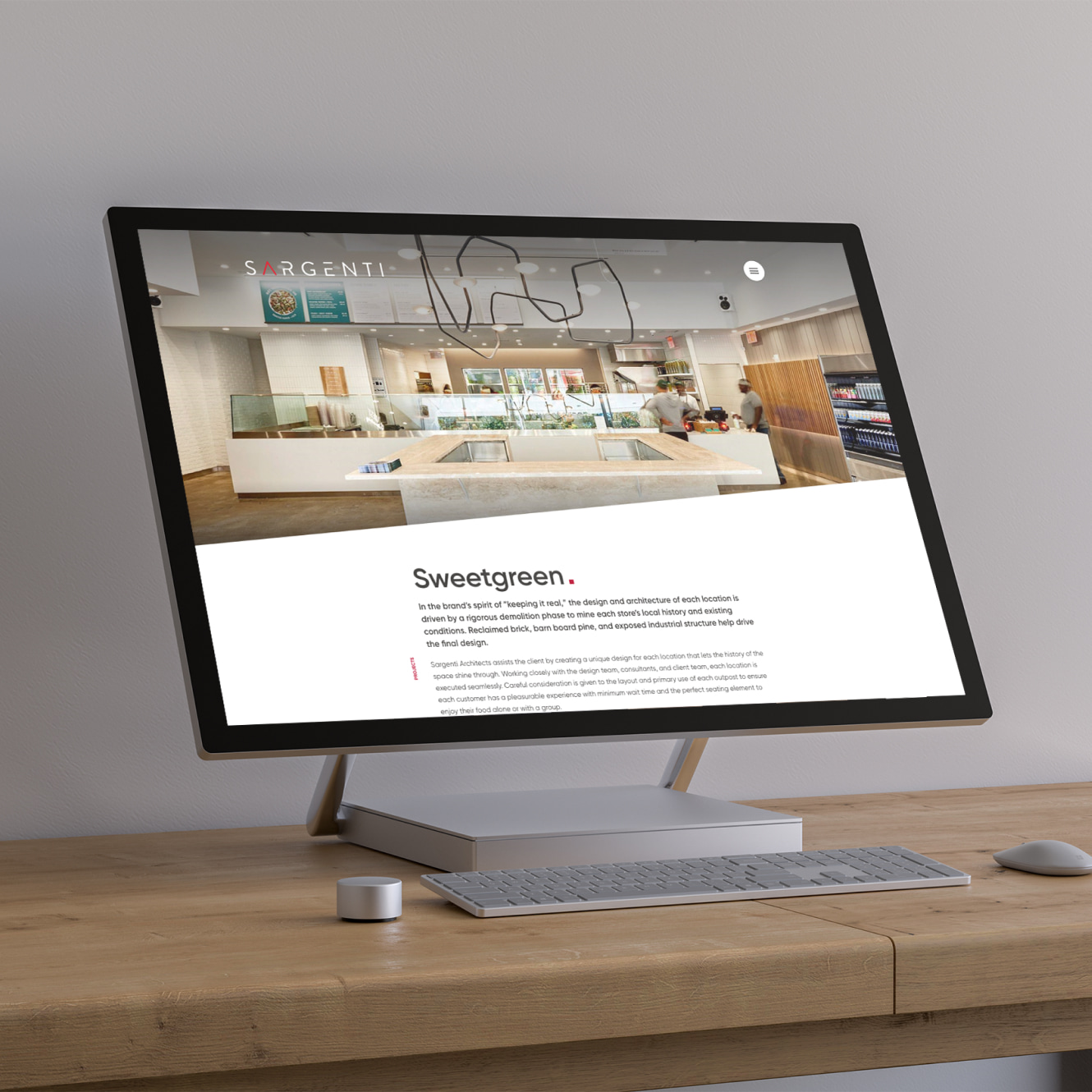
CosciaMoos provides architectural design and planning in Philadelphia. With a forward-thinking approach, the firm specializes in designing functional, modern spaces across healthcare, education, commercial, residential, and hospitality sectors. Their expertise in innovative problem-solving and client collaboration ensures tailored solutions that balance aesthetics, efficiency, and performance.
The Ask.
CosciaMoos engaged Third & Arch to address the challenges they were facing with managing site content efficiently, while also ensuring the user interface design was intuitive, visually appealing, and easy for their diverse audience to navigate.
The Answer.
We worked with CosciaMoos to create a seamless and streamlined digital experience for both their internal team and external visitors, improving both the technical infrastructure and user interface design of the new website.
The Goods.
- Technical Audit
- UX Design
- WordPress Development
Assessing the Situation
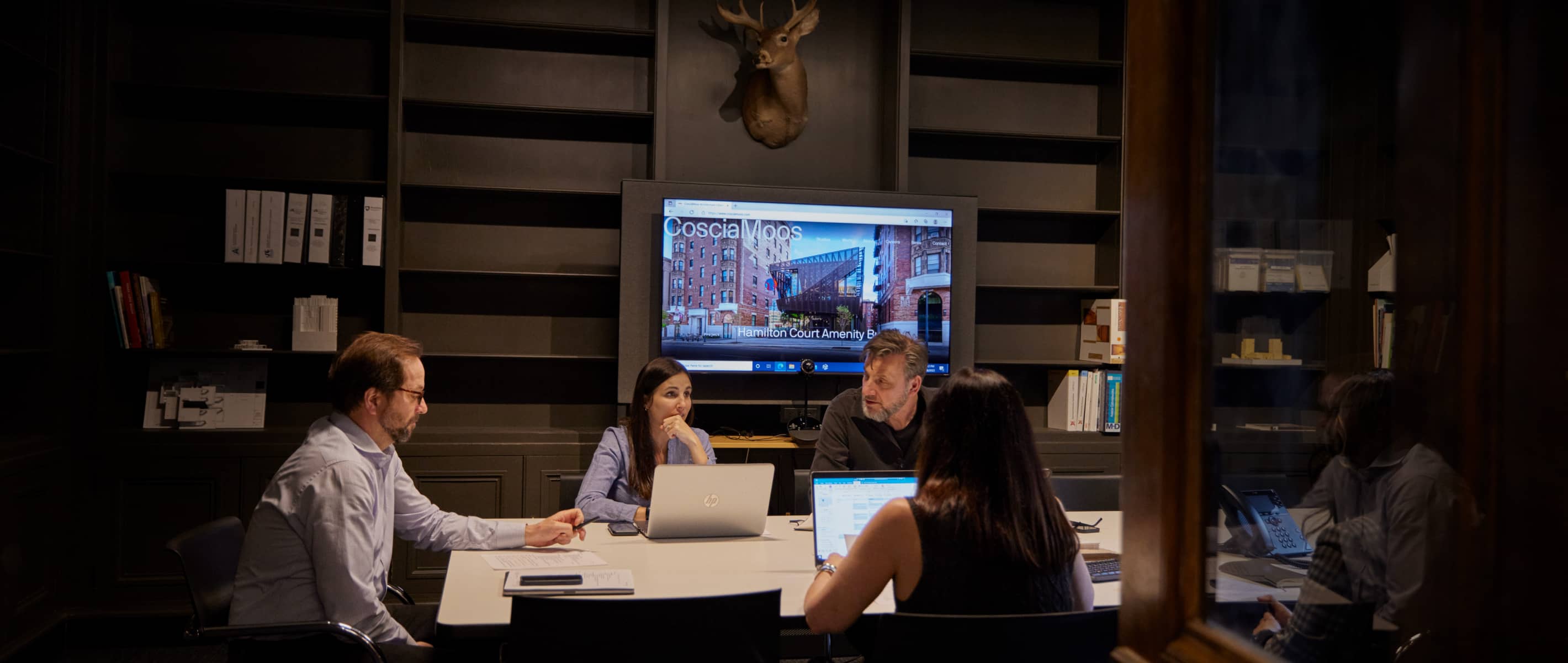
We conducted a Discovery Workshop, audited the website backend for bloated code, reviewed the front-end for potential user experience improvements, evaluated the site’s ADA compliance scores, and discussed SEO performance to-date.
Understanding the Target Audience
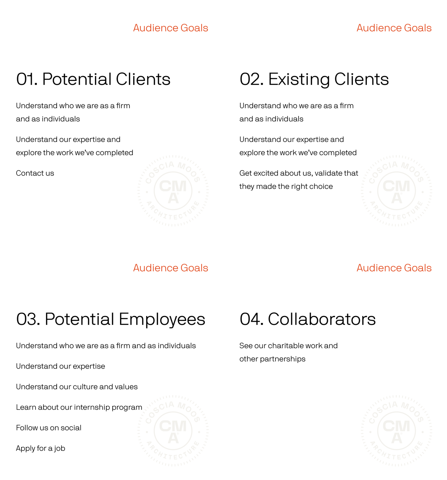
It is crucial to identify your website's target audience and thoroughly understand the specific objectives each key demographic seeks to achieve when interacting with your website. A well-designed website goes beyond aesthetics by focusing on the users' functional and emotional needs. During our comprehensive Discovery Workshop, we took a deep dive into defining the user experience goals for CosciaMoos' distinct audience segments. By closely examining their motivations, expectations, and desired outcomes, we laid the foundation for creating a user-centered experience intended to resonate with each individual audience group.
Clean and Visually Appealing Design
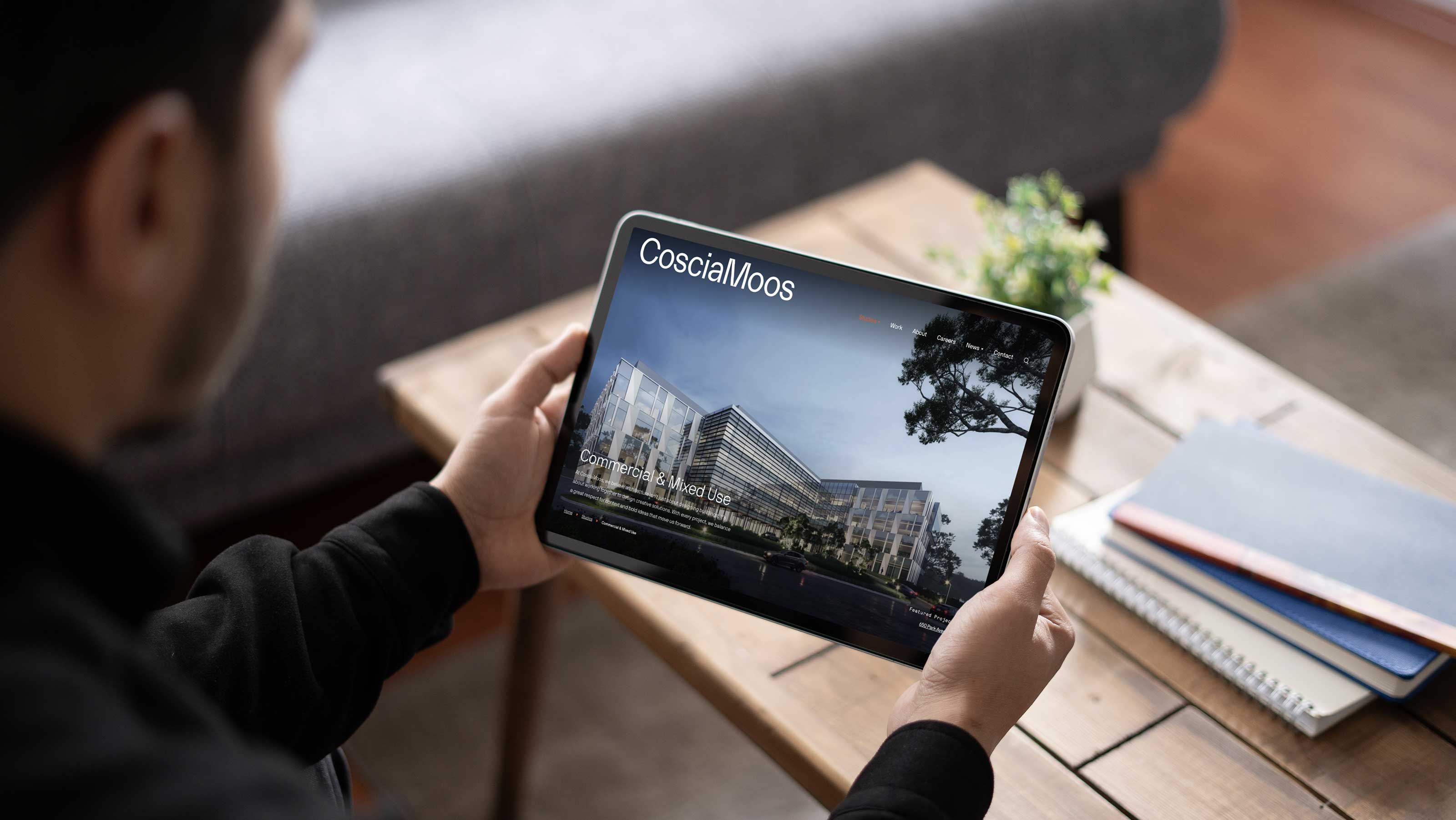
CosciaMoos is a renowned architecture firm, widely recognized for delivering exceptional and visually striking projects that push the boundaries of design and innovation. To effectively showcase their impressive portfolio of work, we employed a thoughtful and intentional approach, emphasizing the beauty and craftsmanship of their projects. By using large, full-screen images, we ensured each project is given the space and attention it deserves, allowing the intricate details and overall impact to take center stage. Additionally, we embraced a clean, minimal design aesthetic to complement the firm's creative vision, allowing the work itself to shine without unnecessary distractions. This streamlined design approach not only highlights the sophistication and elegance of their projects but also creates an engaging and immersive experience for visitors.
Improving the User Experience Across All Devices
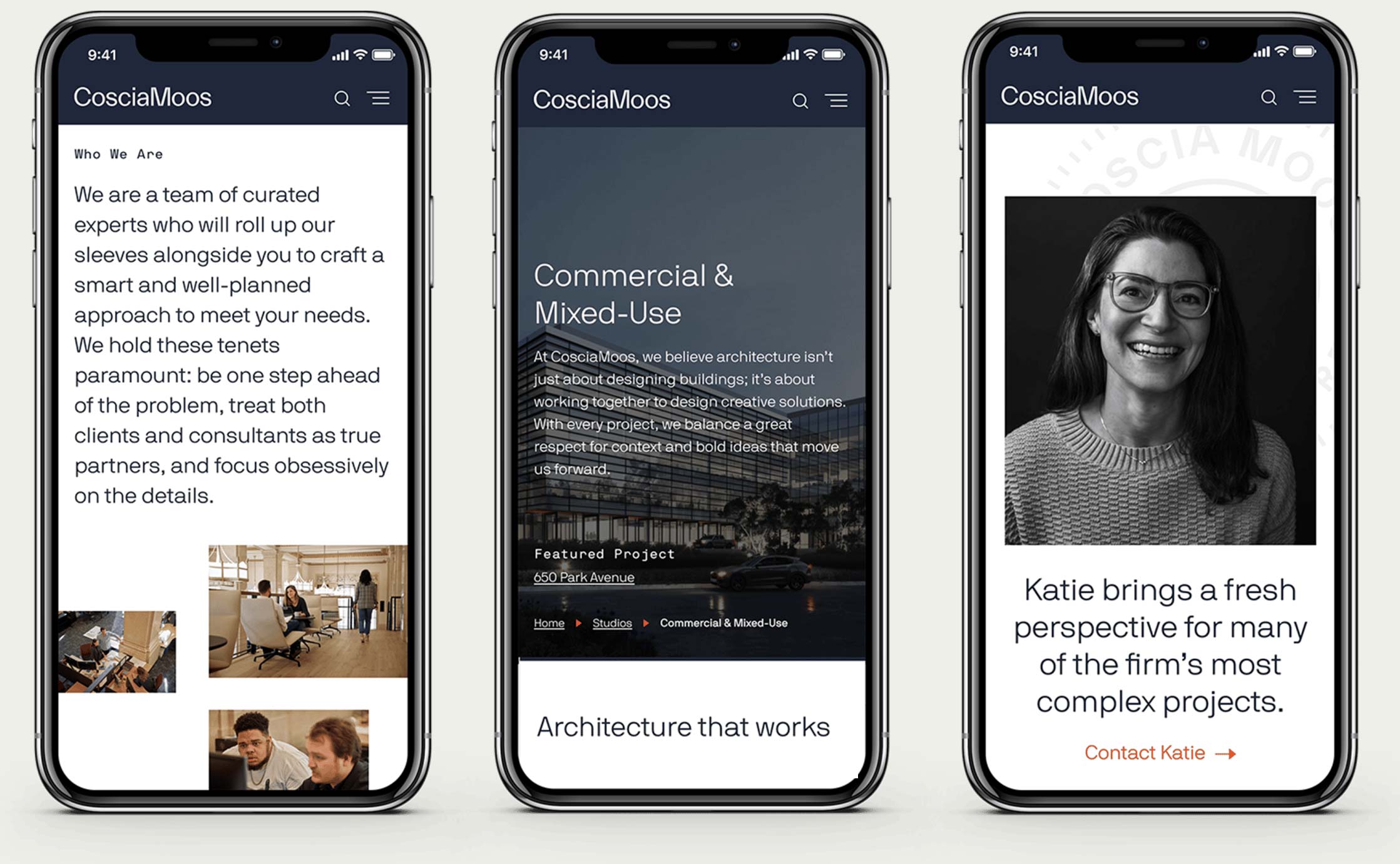
Through our in-depth audits and comprehensive analysis, we identified several front-end features that could significantly enhance the overall user experience for CosciaMoos’ diverse audience. By carefully evaluating the existing design and functionality, we were able to recommend a range of strategic improvements to address key usability challenges and create a more intuitive and seamless user experience. Among these recommendations, we focused on refining navigation to help users find relevant information without confusion or unnecessary steps. We also made adjustments to the contact forms, optimizing their layout and functionality to drive higher conversion rates. Additionally, with the growing importance of mobile accessibility, we prioritized mobile optimization to provide a consistent and user-friendly experience whether visitors are browsing on a desktop, tablet, or smartphone. These changes collectively worked to elevate the user experience, making the new site more engaging, responsive, and efficient for all of CosciaMoos' audiences.
Coding for Usability
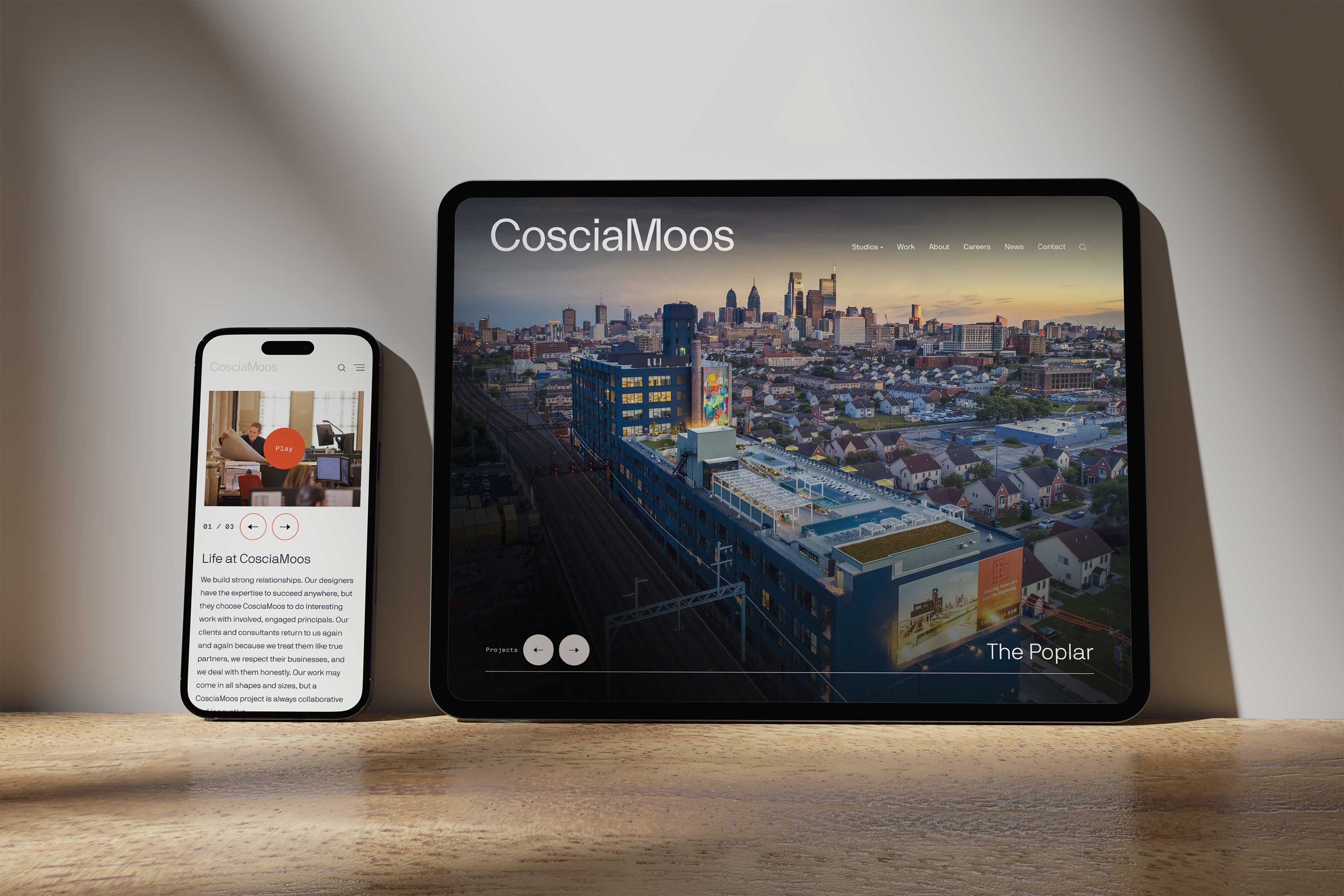
The existing site had reached a point where it was almost impossible to manage, edit, and update content. This inefficiency was creating significant challenges for the client. Recognizing the urgency of the situation, our skilled team of developers conducted a thorough audit of the backend code to identify key areas that were causing the bottlenecks and inefficiencies. During this detailed review, we uncovered a number of opportunities for improvement, particularly in terms of code structure, functionality, and overall performance. With these insights in hand, we set out to rebuild the site from the ground up, focusing on a solution that would empower the client to easily manage and update content without the technical barriers they had previously faced.
Turning a Headache into an Asset
CosciaMoos Architects' previous website had become a real headache, as it was difficult to manage and lacked support from their previous developer. The ask? Create a more modern web design that was visually appealing, easy-to-update and optimized for mobile devices. With an understanding of their current challenges, we revamped the site from the ground up while simplifying the backend and addressing their audiences' needs. Now, CosciaMoos has a website that works for them, not against them, making it easier than ever to showcase their work and connect with clients. Through a combination of a user-friendly content management system, enhanced accessibility, and SEO-focused development, we created a future-proofed website that offered long-term scalability, performance, and ease-of-use for the client and their team.
The Result.
