
The Foundation.
Enhancing Readability and Accessibility: The Importance of Color Contrast for AEC in Website Design

Length
5 min read
Topic
Articles & Insights
98% of the world’s top one million websites do not offer a fully accessible experience for individuals with learning disabilities, visual impairments, or hearing impairments. Yet, there are a reported 2.2 billion people globally with at least one type of visual impairment, let alone learning disabilities or hearing impairments.
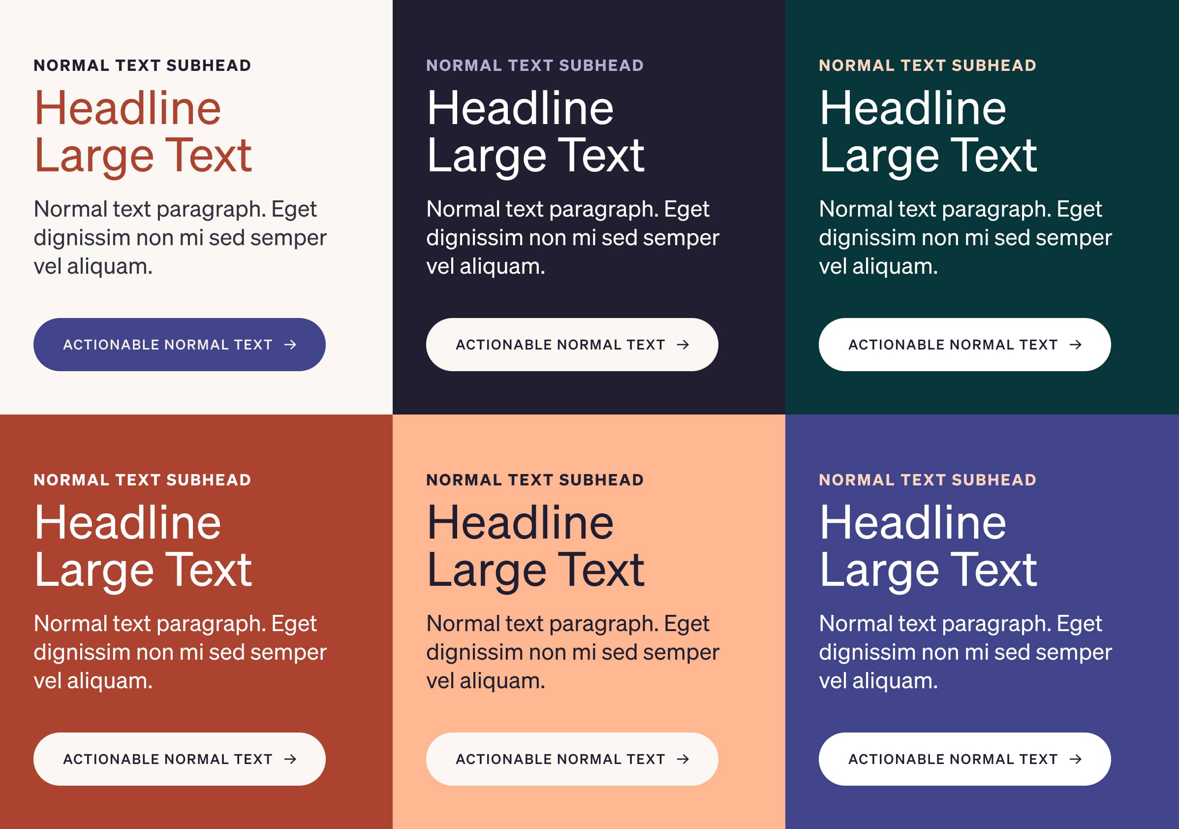
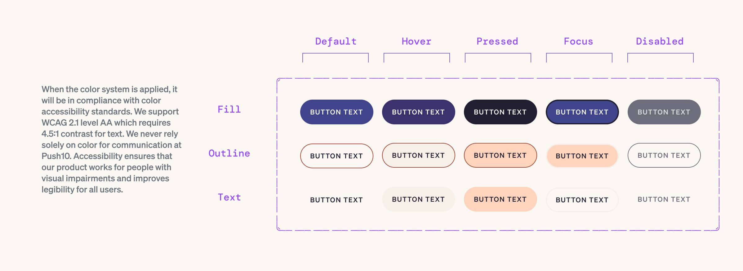
When creating color palettes for web design, it’s important to thoroughly consider color contrast. This step is essential to ensure the readability and accessibility of the design. The difference between the colors used for text and the background can either allow for a seamless web experience or create obstacles.
Ignoring contrast can lead to poor user experience and potentially exclude users with varying visual abilities. But luckily, it’s easy to address! In this article, we’ve put together some general information and tips on how to accomplish compliance.
A vs AA vs AA
These letters represent different levels of compliance with the Web Content Accessibility Guidelines (WCAG). They categorize the degree to which a website ensures inclusivity and usability for individuals with disabilities.
In essence, the progression from Level A to AAA reflects a commitment to inclusivity. While Level A ensures a basic level of accessibility, Level AA strikes a balance for broader usability, and Level AAA represents a pinnacle of thorough accessibility. Choosing the appropriate level of compliance depends on the website’s purpose, target audience, and resources, but regardless of the chosen level, the overarching goal remains the same: crafting digital landscapes that cater to all users, regardless of their abilities.
A
This is the bare minimum but a great starting point. Level A compliance addresses the most fundamental accessibility requirements, covering essential elements for basic user interaction. If a website fails to conform with Level A compliance, it has serious accessibility barriers and will most likely not meet legal requirements for accessible websites in most countries.
Color Contrast Requirement: There is no requirement
AA
Level AA goes a step further by encompassing a broader range of criteria, including those that contribute to a more comprehensive and user-friendly experience. As many accessibility laws require Level AA conformance, it’s recommended that your website meet this level.
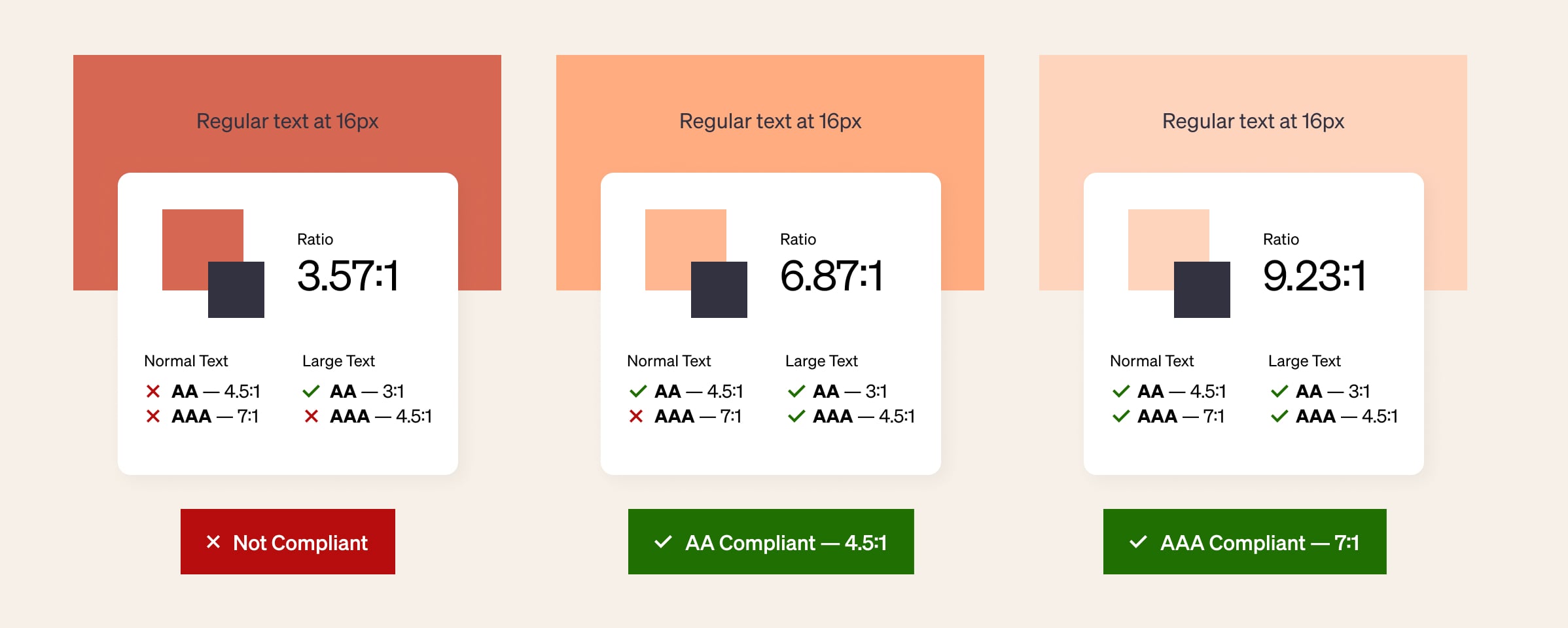
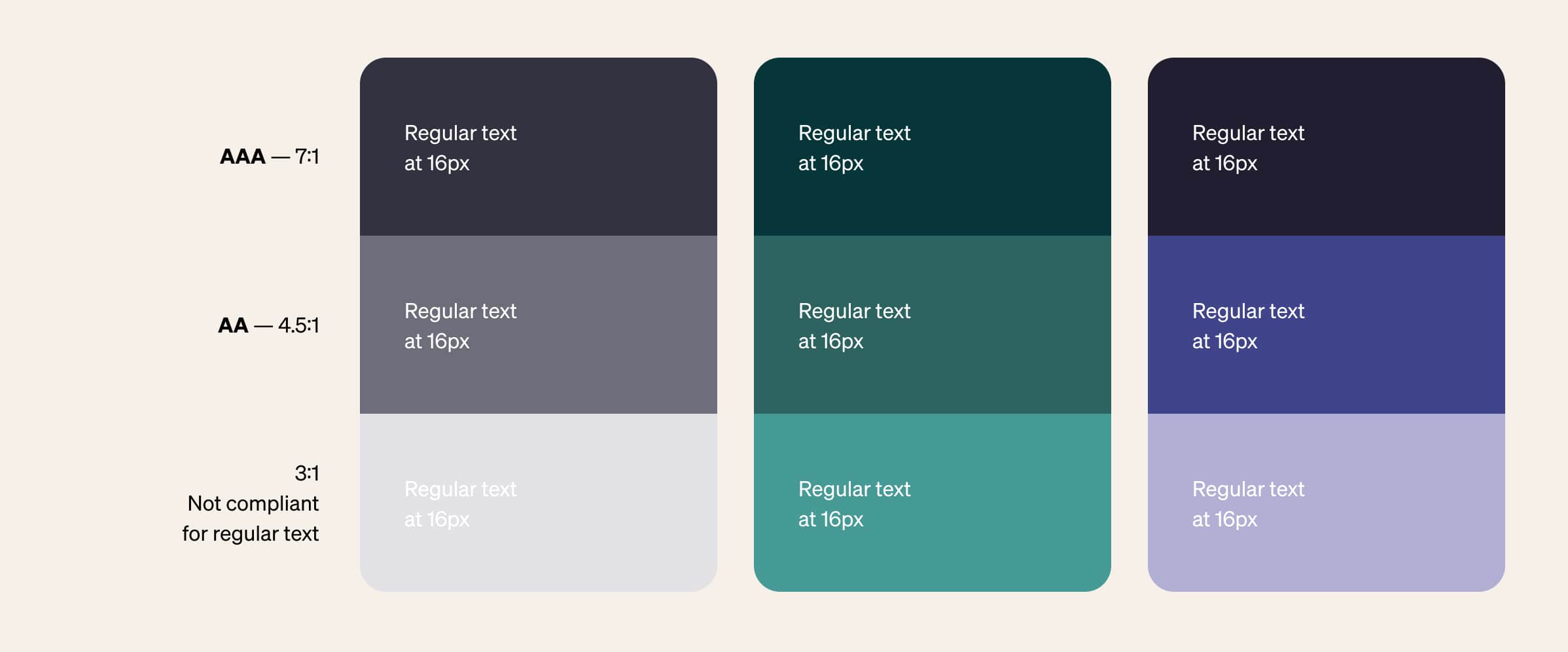
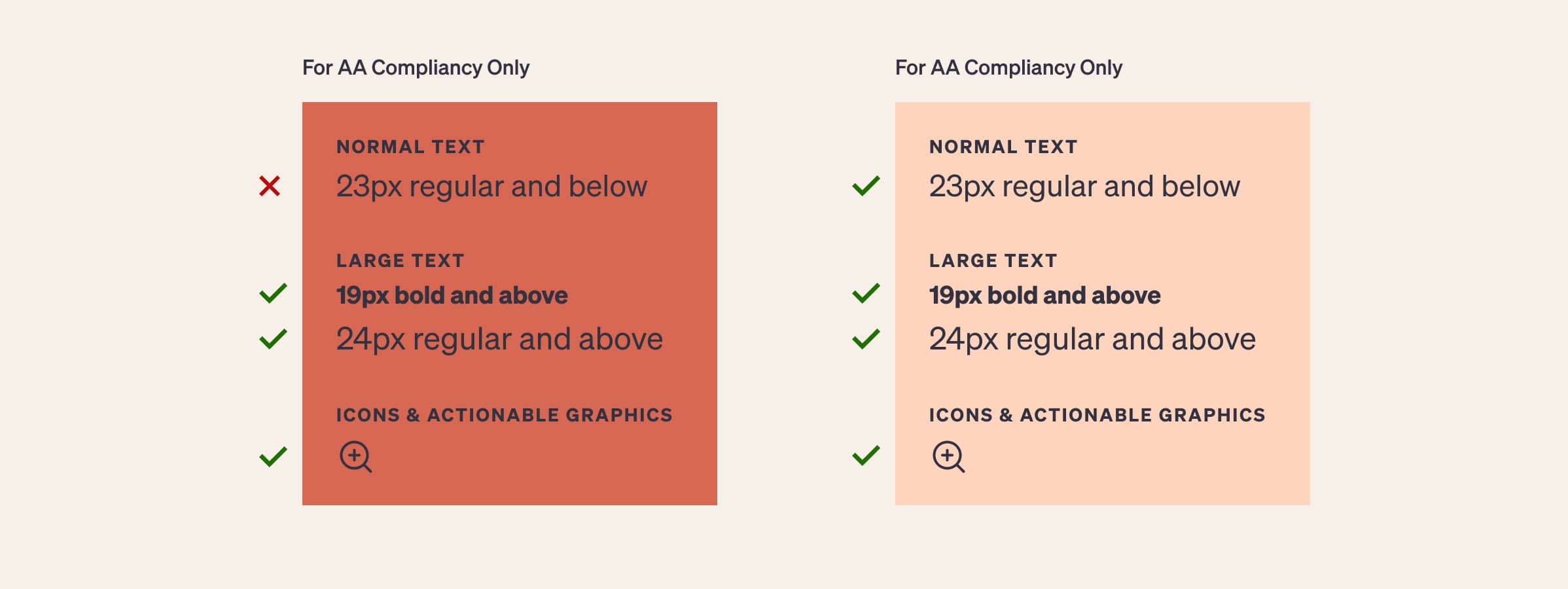
Color Contrast Requirement: A color contrast ratio of at least 4.5:1 for normal text; large text should have a contrast ratio of at least 3:1.
AAA
Represents the highest level of accessibility, encompassing a significant array of guidelines to provide an exceptionally accessible experience. However, it’s generally acknowledged that certain types of content might face practical limitations in meeting every single guideline at this level.
Color Contrast Requirement: A color contrast ratio of at least 7:1 for normal text; large text should have a contrast ratio of at least 4.5:1.
How Do I Do It?
- Create a flexible, dynamic color palette (for web)
- Use a color contrast analyzer. Here are some of our favorites:
-
- Leonardo
Why we like it: To create accessible color palettes for data visualizations - Contrast Grid
Why we like it: Quick way to see which of the color pairings in your palette are accessible and which fail. - Stark
Why we like it: It has everything! (and is available as both Figma plugin and browser extension) - WebAIM
Why we like it: By the internet’s authority on accessibility, so you know it’s correct. - Adobe
Why we like it: Easily separates out type sizing and graphic elements, and lists what “Normal” and “Large” text means. - Userway
Why we like it: Addresses when colors are “borderline – very close to WCAG fail” or “good” or “perfect”. - Venngage
Why we like it: Addresses type sizing (in pixels) and graphic elements. Has an “in situ” example that details the type sizing. - Contrast
Why we like it: Straightforward Figma plugin.
- Leonardo
-
- Double-check your font sizes
- Establish approved color pairings
- Document!
Why It Matters
The Department of Labor reports there are approximately 33 million people of working age in the United States alone with disabilities—and only 18.5 million are employed. According to a report from Accenture, the GDP could receive a boost of up to $25 million if just 1 percent of that group joined the workforce. Imagine how many more people might return to your site if it was a seamless experience for them?
Working towards complete compliance not only benefits those with visual impairments and disorders but ultimately, it makes the experience better—for everyone.