Joseph B. Callaghan, Inc. (JBCI) is a trusted structural engineering firm based in Philadelphia, known for its expertise in building envelope assessment, structural design, and forensic engineering. With a solutions-driven approach, the firm provides innovative engineering services across commercial, institutional, and historic preservation projects. Their commitment to technical excellence and client collaboration ensures durable, high-performing structures that stand the test of time.
The Ask.
JBCI approached Third & Arch to bring their brand and website in line with the professionalism and deep industry expertise the firm is known for.
The Answer.
After an in-depth discovery process, we helped position JBCI as an industry leader through a rebrand which included a crisp, new visual identity and modernized website design.
The Goods.
- Brand Strategy
- Visual Identity
- Web Design
- Web Development
- Print Design
A New Logo Design for a Trusted Firm
Our goal was to craft a timeless visual identity that stood out from stodgy competitors and could easily be applied consistently across a wide variety of marketing materials. Inspired by technical drawings of building structures, we used precise line art to create the logo that feels fresh and modern, while paying homage to JBCI’s storied legacy.
Bold Photographic Treatment
To amplify the geometric line art of the new logo design, we applied a masking effect to photography using a flood of color from the new brand palette. This photographic treatment is used sparingly, yet adds notable dimension to JBCI's web design and marketing materials.
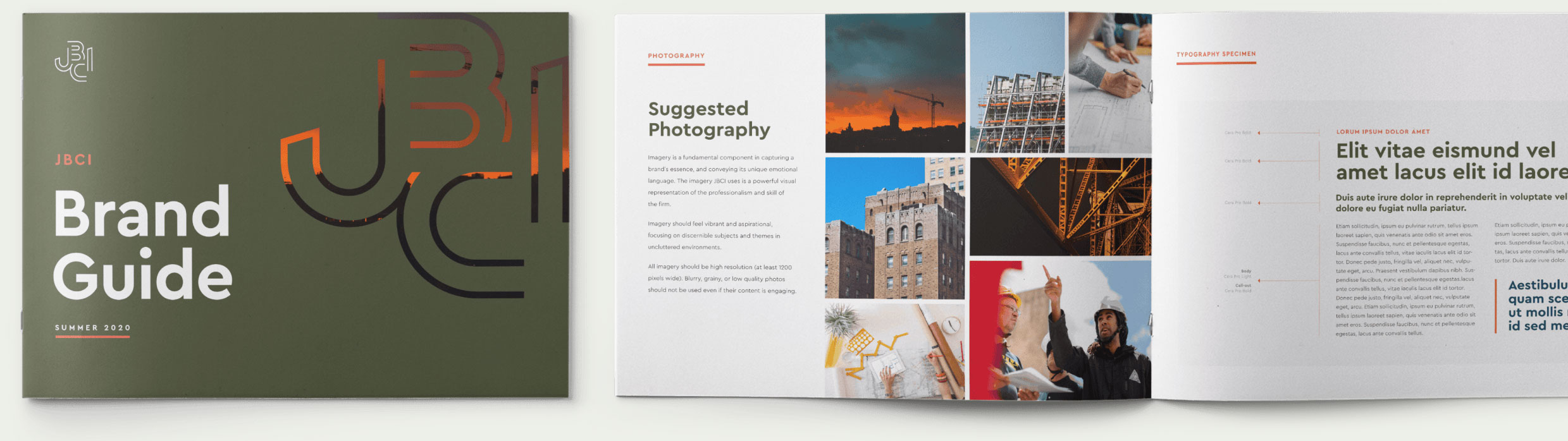
Brand Consistency is Key for Engineering Firms
We designed a comprehensive brand style guide for JBCI, enabling consistent, professional communication to build trust, improve brand recognition, and set our client apart in the competitive AEC market. By standardizing visual and verbal elements, the style guide helps to provide consistent brand management across teams, enhance marketing outreach, and attract talent. With improved brand consistency, JBCI was able to strengthen client relationships, support business growth, and uphold the firm’s reputation for reliability and expertise.
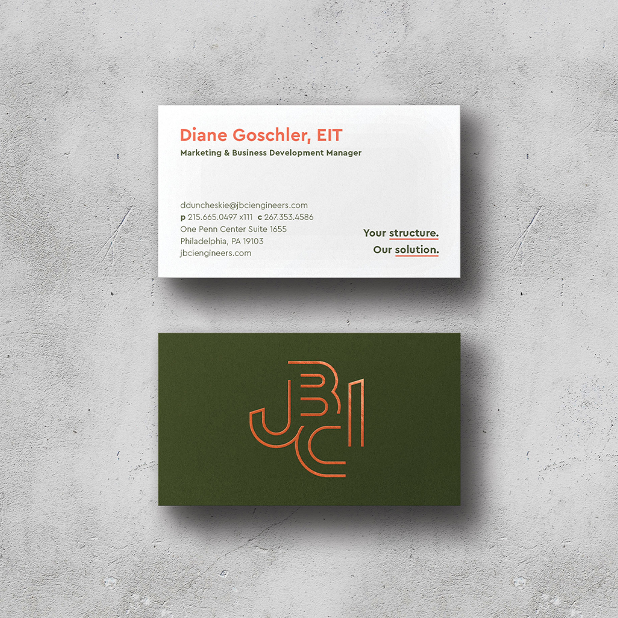
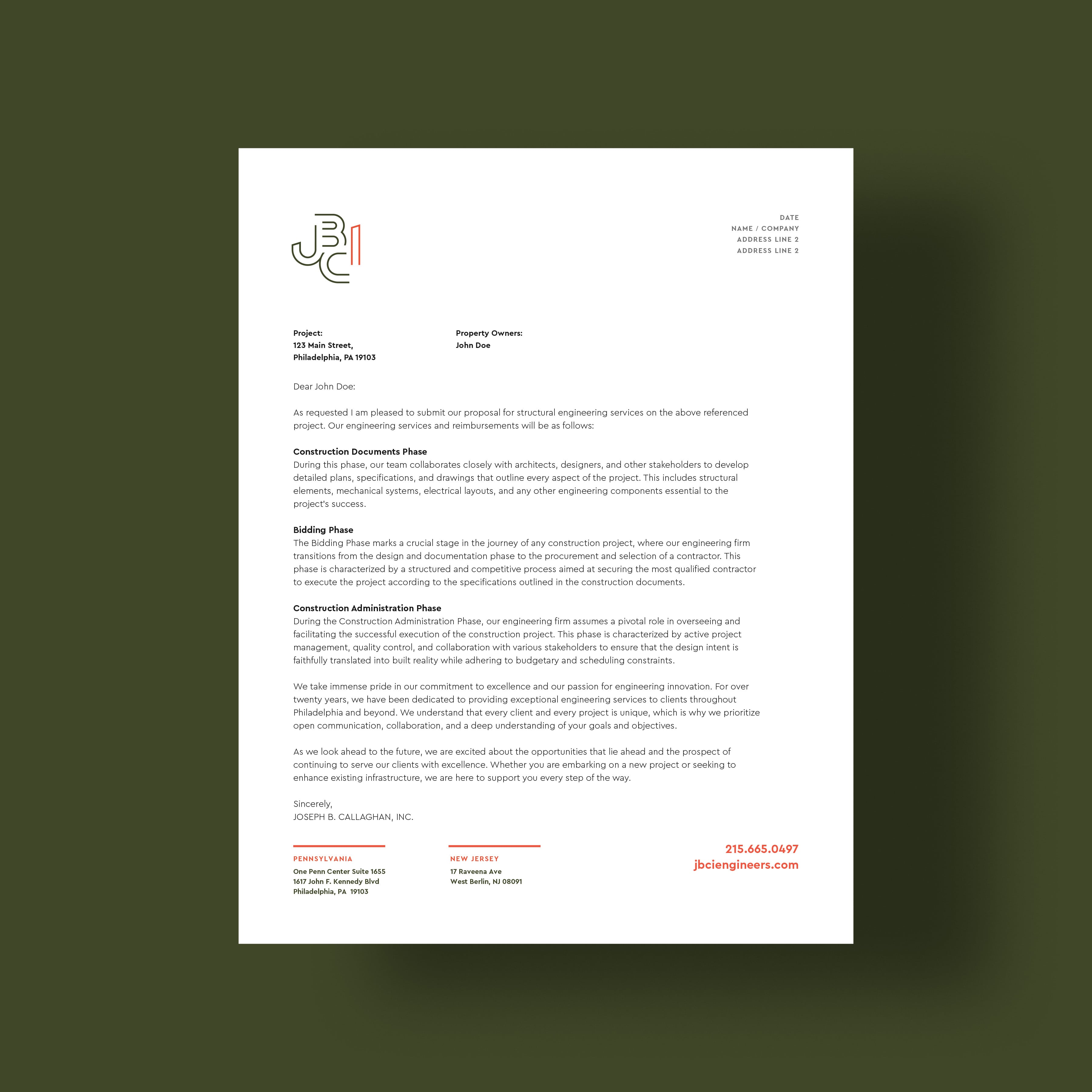
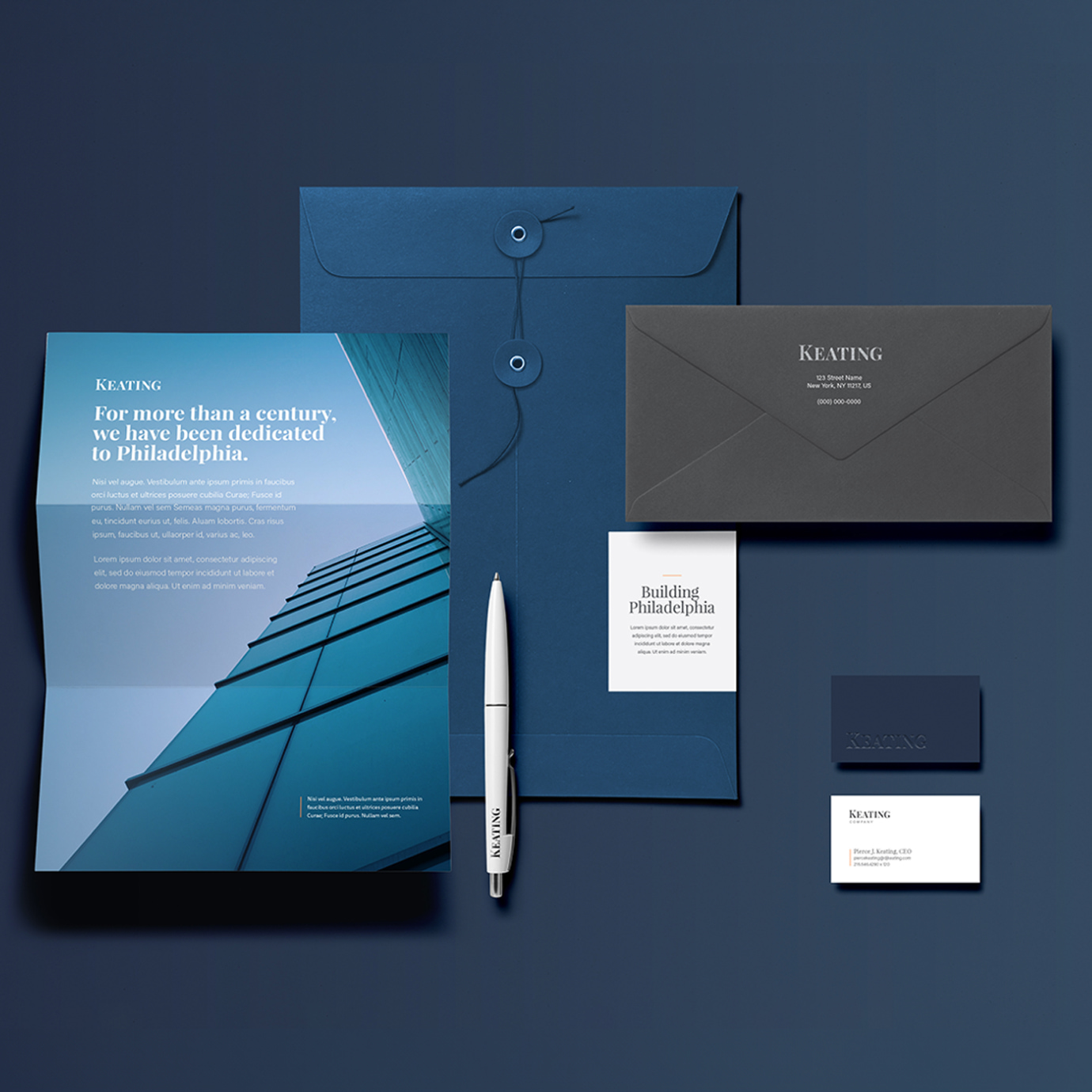
Professional and Sophisticated Corporate Identity
We provided JBCI with professional and sophisticated corporate identity collateral, including business cards, letterhead, proposal templates, presentations, and more. With an improved and professional appearance, JBCI was able to reinforce their reputation for precision, reliability, and technical expertise. In an industry where trust and credibility are paramount, polished collateral communicates attention to detail and professionalism, giving prospects, clients, and partners confidence in the firm’s capabilities.
A Website That Works
We crafted clear user journeys for each of our audience personas to find the content they care about the most. The site features multiple tools and systems to capture visitor’s information as they learn more about the engineering firm.
Dynamic Projects. Dynamic Case Studies.
We designed dynamic and engaging case studies for JBCI, showcasing expertise, problem-solving skills, and successful project outcomes, while also helping to build credibility and trust with potential clients. These compelling case studies provide concrete examples of past successes, reduce perceived risk, and attract more qualified leads to the engineering firm’s new website.
Branded Icon Designs
We designed a suite of branded icons to reflect JBCI’s areas of expertise. For consistency, the treatment of the orange “i” used in the logo is applied to similar shapes in each icon, providing a branded appearance. These icons are used for both print and web applications and also come to life as animations on the homepage.
The Result.