Millan Architects is a Philadelphia-based architectural firm founded in 2001, specializing in crafting thoughtful spaces of enduring beauty, lasting value, and environmental sustainability. Serving residential, commercial, and institutional clients, the firm combines broad vision with technical skill to transform concepts into reality.
The Ask.
With over 115,000 architects in the US, selecting the right firm can be a daunting task. Many claim to offer the same level of service, making it difficult to discern who truly stands out. Millan Architects (MA) recognized this challenge and sought a solution to elevate their brand above the competition.
The Answer.
We crafted a comprehensive brand strategy to distinguish Millian Architects from the crowded market
The Goods.
- Market Research
- Brand Strategy
- Brand Identity

Review the Competition
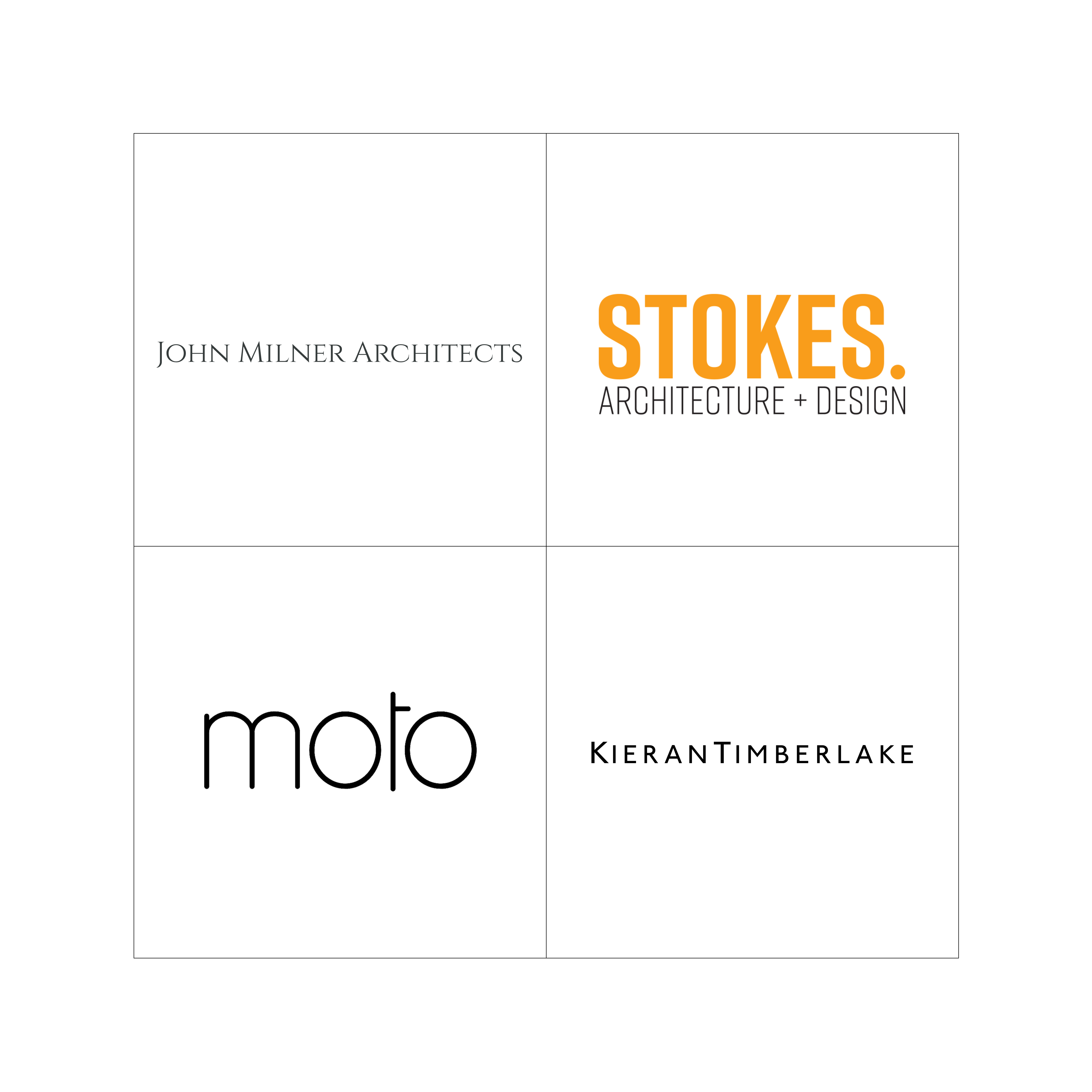
To stand out among the competition, we first needed to know who they are. Before writing or designing anything for the MA brand, we took careful inventory of how their competitors presented themselves to the public: Where are they strongest? What gaps exist that MA can fill?

Talk to the Clients
We spoke to several of MA’s current and former clients to hear about their experiences. By doing so, we were able to uncover the “soul” of what made this firm so special and exciting to work with. As a result, the final strategy had a layer of depth many brands fail to achieve.

Finding Beauty in Simplicity
The new logo mark we designed for Millan Architects modernized the entire brand identity, while creating a strong form that is built to endure. Just as MA and their clients form close, symbiotic relationships during the project process, the letters in the monogram logo we designed come together to build a form that is stronger than the sum of its parts.

Guiding the Brand’s Long-term Success
A “brand” only works if it’s represented consistently over time. To help the MA team do that, we compiled the full brand strategy and visual identity into a brand guide that outlined the what, why, and how of using MA’s new brand correctly.


The Result.


